
Common Image Problems Calibration Corrects
Professional video calibration is not just about making a picture brighter, sharper, or more colorful. The goal is to make the image more accurate, more consistent, and closer to the standards used when movies, television programs, streaming content, and professional video are mastered.
Many picture problems are easy to overlook because the viewer gradually adapts to them. A display may appear acceptable at first glance, while still showing inaccurate grayscale, poor shadow detail, clipped highlights, exaggerated color, incorrect gamma, or visible edge enhancement.
The examples below show common image-quality problems and how they can affect realism, detail, and overall picture performance.
Why Image Accuracy Matters
A properly calibrated display helps preserve the creative intent of the content. Skin tones look more natural, shadows retain detail, highlights are not crushed, grayscale remains neutral, and color appears more believable.
When a display is not calibrated correctly, the viewer may still see an image, but important visual information can be distorted or lost. Calibration identifies these problems through both visual evaluation and technical measurement, then adjusts the display and video signal chain for more accurate performance.
Visual Examples of Common Calibration Problems
| Visual Appearance | Measurement / Analysis | |
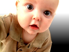
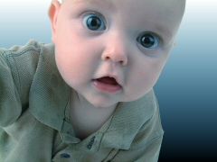
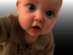
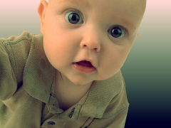
Correct ReproductionThis image represents a more accurate reproduction. Skin tones appear natural, shadow and highlight detail are preserved, and the image has a believable sense of depth and balance. |
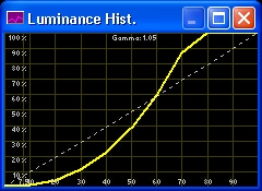
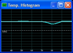
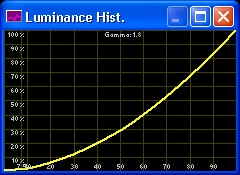
Proper Luminance ResponseA properly adjusted display follows a smooth luminance response from black to white. This helps preserve detail throughout the image, especially in shadows and midtones. |
|
|
|
||
Brightness Too HighWhen the brightness control is set too high, black levels become elevated. The image can look gray, flat, and washed out, with reduced depth and weak shadow detail. |
Elevated Black LevelMeasurement will show that the darkest parts of the image are not reaching the correct black level. This reduces contrast and makes the picture appear hazy or low in depth. |
|
|
|
||
Contrast Too HighExcessive contrast may initially appear more dramatic, but it can crush highlight detail. Bright areas of the image lose texture and become flat or clipped. |
Clipped Highlight DetailA clipped luminance response shows that the display reaches peak white too early. Once this happens, multiple bright detail levels are compressed into the same visible value. |
|
|
|
||
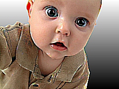
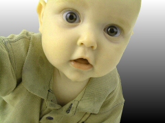
Color Too HighWhen color saturation is set too high, the picture can look exaggerated. Skin tones may appear sunburned, lips can look unnaturally red, and subtle color detail may be lost. |
Oversaturated ColorTest patterns and measurements help identify when color is pushed beyond accurate reproduction. The goal is natural saturation, not exaggerated color. |
|
|
|
||

Color Too LowIf color saturation is too low, the image becomes weak and lifeless. At an extreme, the picture begins to approach black and white. |
Undersaturated ColorMeasurement and test patterns confirm whether color decoding and saturation are properly adjusted for the display and signal chain. |
|
|
|
||
Color Temperature Too HighMany displays are set to appear bright and blue in a showroom. In a real viewing environment, an overly blue image can make skin tones, whites, and neutral grays look unnatural. |
Cool Grayscale TrackingMeasurement will show excess blue energy through the grayscale. Calibration brings the display closer to the correct white point for accurate image reproduction. |
|
|
|
||
Color Temperature Too LowIf the image is too warm, whites and grays can shift toward red, orange, or sepia. This changes the appearance of skin tones and neutral image areas. |
Warm Grayscale TrackingRGB tracking shows whether red, green, and blue are balanced through the grayscale. A neutral grayscale is one of the foundations of accurate video reproduction. |
|
|
|
||
Sharpness Too HighExcessive sharpness creates artificial edges and white halos around objects. This may make the image appear sharper at first, but it is not real detail from the source. |
Visible Edge EnhancementSharpness patterns reveal added outlines, halos, and ringing. Proper setup reduces artificial enhancement while preserving actual source detail. |
|
|
|
||
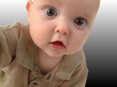
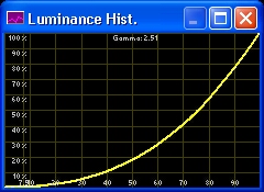
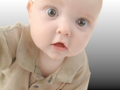
Gamma Too HighWhen gamma is too high, midtones become too dark. The image may look heavy, with reduced visibility in darker areas even if peak white and black appear acceptable. |
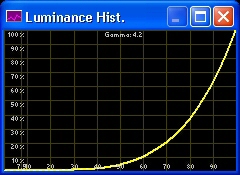
Overly Dark MidtonesA gamma curve that is too steep can hide important detail. Calibration helps restore proper tonal balance from shadow to highlight. |
|
|
|
||
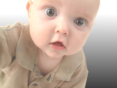
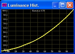
Gamma Too LowWhen gamma is too low, midtones become too bright. The picture can look washed out and lack the depth needed for a convincing image. |
Washed-Out Tonal ResponseA shallow gamma response reduces image depth and contrast. Proper gamma setup helps the image retain dimensionality and realism. |
|
|
|
||
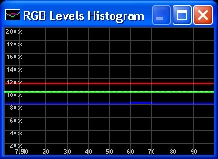
Poor Grayscale TrackingPoor grayscale tracking means different levels of gray shift toward different colors. Shadows may look blue, midtones may look green, and highlights may look red. |
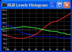
RGB Balance ErrorsRGB tracking measurements identify where the grayscale is drifting. Correcting these errors can have a major impact on image accuracy and perceived realism. |
|
|
|
||
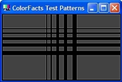
Incorrect TintIncorrect tint shifts color relationships across the image. Skin tones, natural objects, and familiar colors can appear subtly wrong even when the viewer cannot immediately identify why. |
Color Decoding ErrorTest patterns help identify tint and color-decoding errors so the display can be adjusted for more accurate color reproduction. |
|
|
|
||
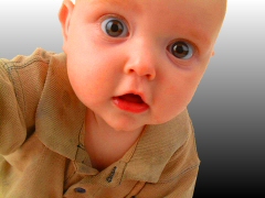
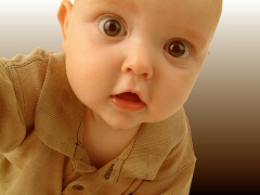
Corrected ImageAfter calibration, the image should appear more natural, balanced, and believable. The goal is not to create an artificial look, but to remove errors that prevent accurate reproduction. |
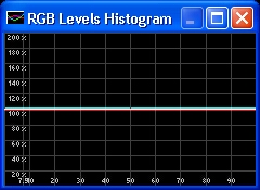
Balanced RGB TrackingBalanced grayscale tracking shows that red, green, and blue remain properly aligned through the display’s operating range. This supports accurate color, neutral whites, and consistent image performance. |
|
Calibration Is a Complete System Process
Display calibration is only one part of accurate image reproduction. Source devices, video processors, HDMI signal paths, picture modes, HDR settings, room conditions, screen characteristics, and viewing environment all affect final image quality.
LionAV evaluates the complete video system so the display or projector can perform as accurately and consistently as possible in the real viewing environment.